Launched: Equine Enrichment
BRAND AND WEBSITE REDESIGN
** This is a re-creation of the original blog post from April 2018 **
As creatives, we all have those projects that stand out to us. The milestones. The game changers.
This project was one of those.
When Angie of Equine Enrichment entrusted me with her business she became my first paid project. What do you get from firsts? Lots of learns, lots of excitement and lots of growth.
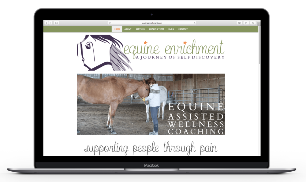
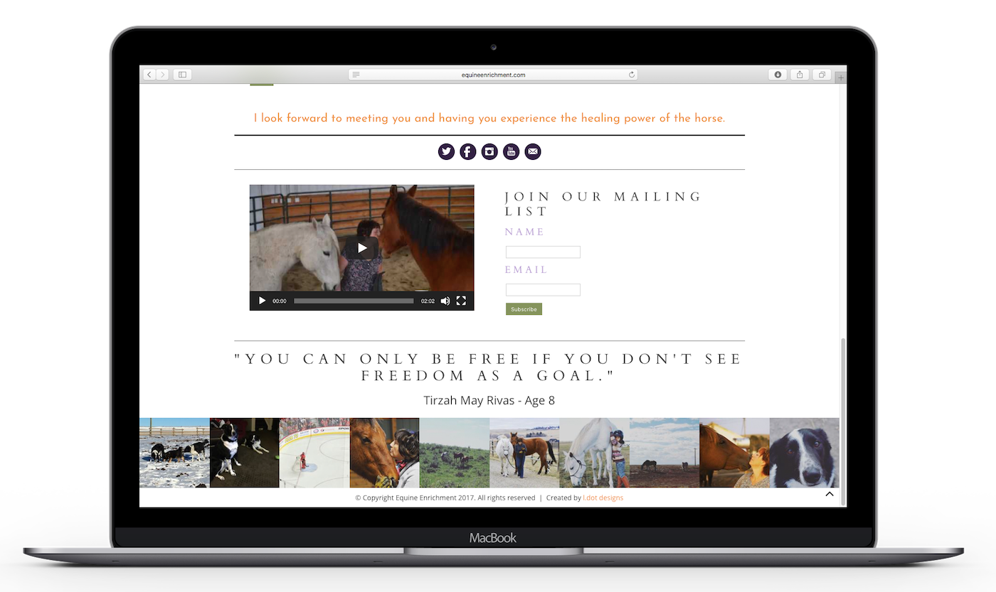
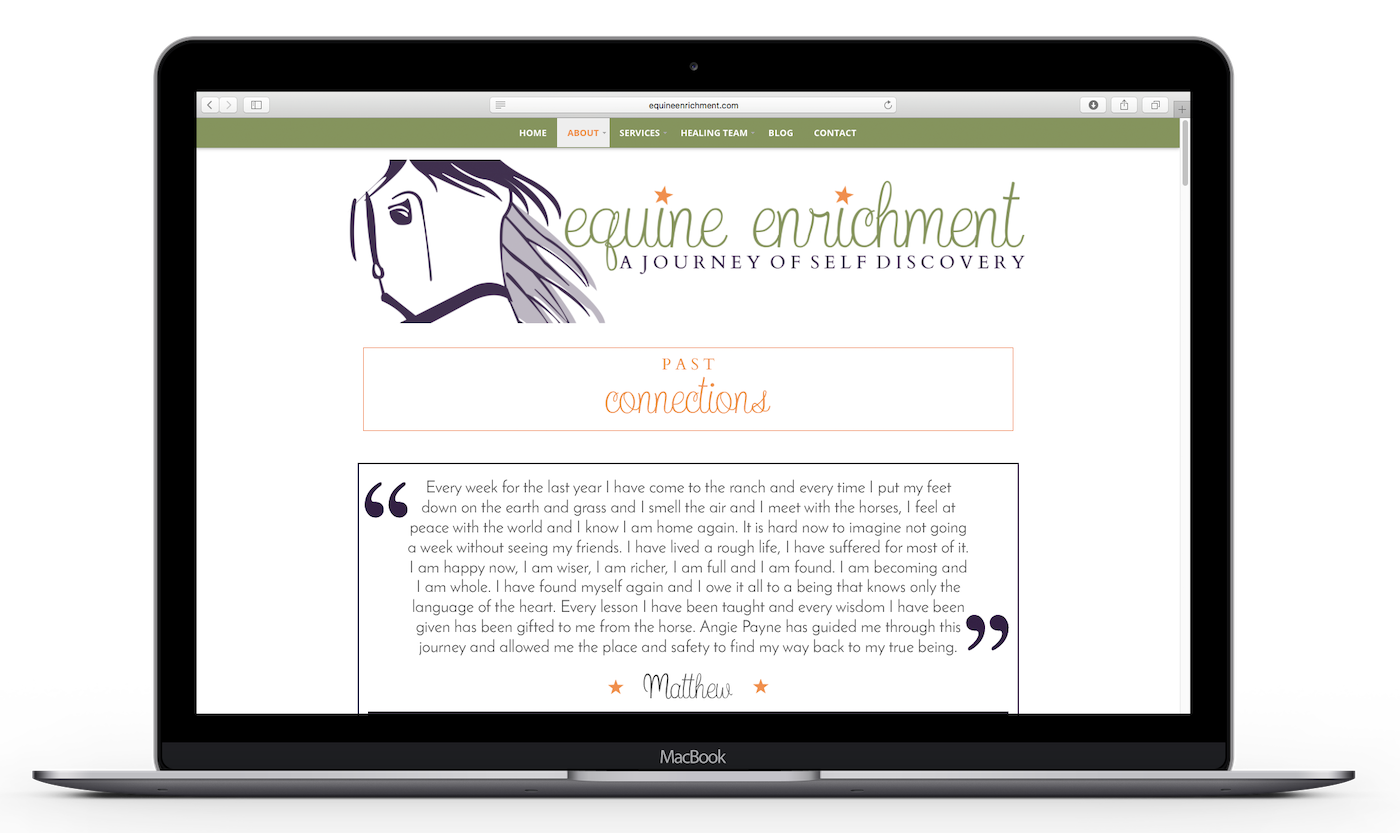
Enjoy our final results and be sure to check them out for yourself at equineenrichment.com.
THE BRAND
BRAND VISUALIZATION
It’s the end of March and the feeling of spring is just starting to set in. There is a freshness to the world around you. Even though the world is the same as it was yesterday, it feels different and exhilarating.
To celebrate this newness, you decide to go on a journey. You find yourself at a beautiful little lavender farm. There is a calm breeze, making the lavender sway in the wind. You imagine them as unique individuals, dancing to their heart beats drum. Their smell is intoxicating. It relaxes and calms you. This is a welcome treat to contrast the excitement of spring. As you walk through the field you feel grounded and connected with the earth.
Off in the distance you notice the sun is starting to set. You’ve been so lulled by the beauty of your surroundings you lost track of time. You sit down in the field, surrounded by dancing lavender and watch as the sun casts shades of tangerine orange across the sky. You’re filled with a sense of peace and gratitude. As the sun disappears from the sky, a smile appears across your face. It’s time to move forward and you are ready. With the grace of the lavender, dancing in rhythm with nature, you move forward into the unknown.
Angie is a spunky, fiery, authentic, colourful women and I really wanted this reflected in her brand. When she disclosed to me that her favourite colours were green, purple and orange, I thought let's go with it! This colour palette may be unique but I personally feel it mirrors Angie's personality beautifully. (Want to know what I mean? You'll need to meet her to find out 😈)
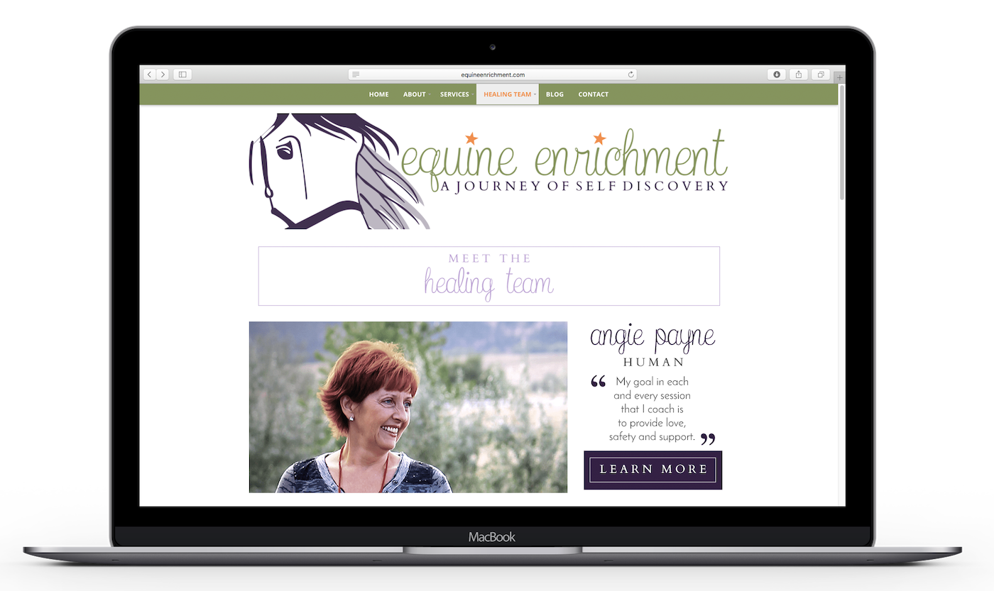
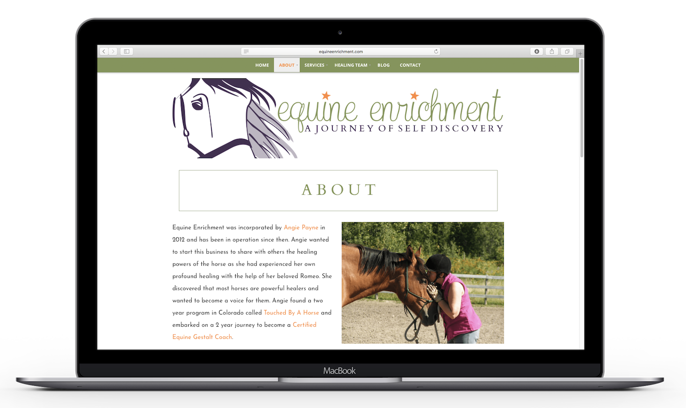
When it came to Angie's logo, she wanted to stick with her original illustration: Romeo the horse. Romeo is Angie's healing partner in crime and has played an extremely important role in her life. Understandably so, this part of her past logo held sentimental value.
One of my favourite elements of Angie's brand is the little orange stars over the "i" This was actually her idea, not mine and I LOVE it. I originally started implementing these stars into Equine Enrichment's brand thanks to inspiration from a quote Angie shared with me.
"Tired of trying to cram her sparkly star-shaped self into society's beige, square-shaped holes, she chose to embrace her ridiculous awesomeness and shine the like freaking supernova she was meant to be"
This quote is one that Angie considers to fully embody what Equine Enrichment is all about and I couldn't agree more ♥
COLOUR SYMBOLISM:
Purple: Spirituality, Creativity, Wisdom, Independence, Magic, Feminine
Green:Peace, Harmony, Ambition, Freshness, Healing, Safety
Orange: Happiness, Creativity, Determination, Success, Encouragement, Invigorating
CORE VALUES:
♥ Compassion
♥ Believe
♥ Unique
♥ Enough
♥ Connection
♥ Harmony
♥ Authenticity
♥ Release
THE WEBSITE
For her website, Angie decided she wanted to stick with Wordpress rather than going to Squarespace direction. At this point, I already knew I was planning to use Squarespace as my design platform. I decided "what the heck 😉" and gave good old Wordpress one last hurrah.
I originally learnt on Wordpress and I actually have far more experience using it. I'm not going to lie to you and say that some days I don't wish Squrespace had some of the customizability that Wordpress has. BUT the pros definitely outway the cons and I still love me some Squarespace.
For Angie's website I decided to use a premium theme from a company that creates the most GORGEOUS Wordpress themes: Bluchic. The theme I specifically used for Equine Enrichment is called Jacqueline and you can buy it here. *
Once I got down to business designing Angie's website, my main focuses were:
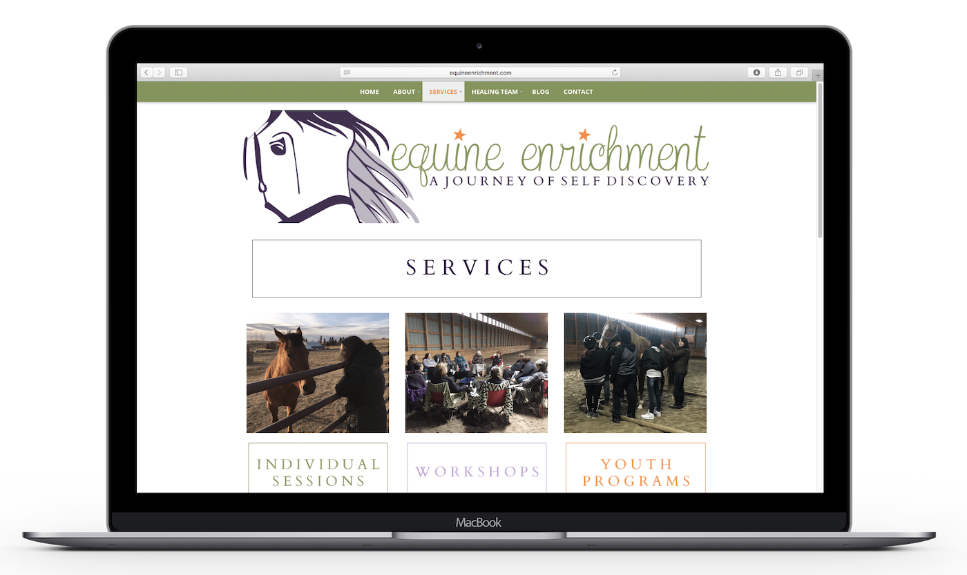
♥ Consistent branding: Besides the colour brown, Angie's past website lacked consistent branding. Fun fact: In the end, I created over 150 visuals in order to make sure her branding had a strong presence.
♥ No Brown: Before revamping Equine Enrichment, it had quite natural colour palette. Angie really wanted it to reflect her, and the brown palette just wasn't doing it.
♥ Clean and Easy to Navigate: Pretty self explanatory. I wanted the Equine Enrichment site to be inviting and easy to use.
Overall, I just wanted Angie's new website to feel like HER. I wanted it to feel authentic. I wanted it to feel clean. I wanted it to feel inviting.
BEFORE
AFTER
In the end I'm so happy with how Angie's project came together. It was such a pleasure to work with this viberant, down to earth women. Give the actual finished product a look for yourself here. Enjoy 😘
P.S. Curious if we'd be website besties? Me too! Send me a little email over this way. Pretty sure we'd make a great team? Fill this bad boy out and let's get this show on the road!
P.P.S. If you'd like to know more about my experiences with this project, give these other blog posts a gander:
The astrics above indicated an affiliate link. It means if you were to purchase something via Bluchic, I would get paid. Whether or not I get paid, I only recommend prodcuts I stand behind 😊

